- 888.396.2465
- Contact us
- Support
- Log In
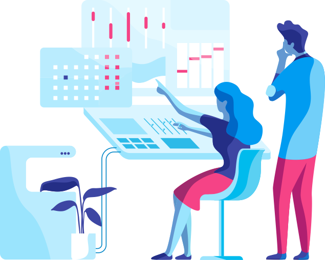
Your Data & AI Platform
for Brands & Hospitality
It's the Data and AI infra-to-insights solution you're missing.
Allow your marketing, finance, and analytics team to operate the business collaboratively using data-driven insights to grow revenue, decrease costs, and save time trying to build something from scratch in-house!
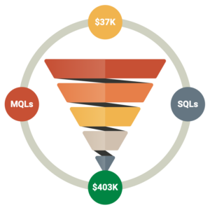
RevOps and PplOps:
Maximize Revenue,
Minimize Costs & Attrition
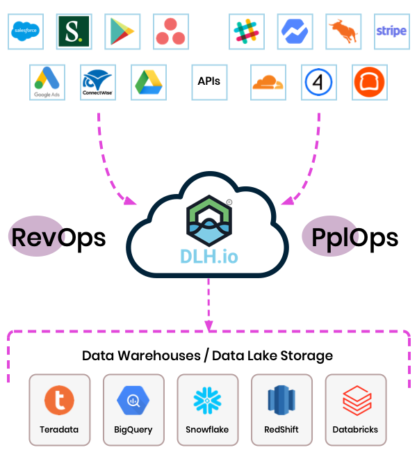
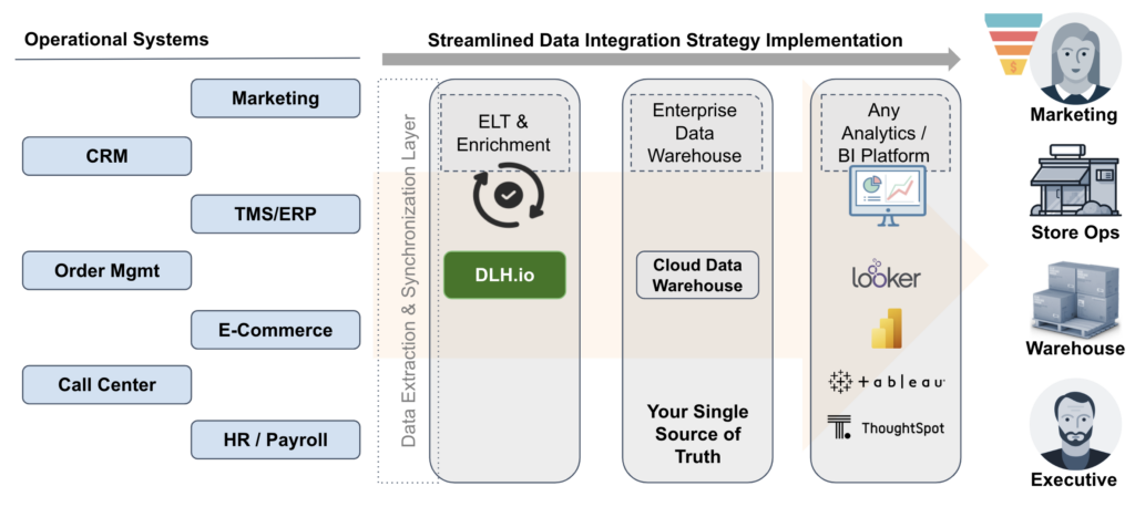
Our Modern Data Stack Infrastructure takes the grunt work out of internal development time. Bolt on to your existing ERP, CRM, POS, and/or HRIS systems quickly. From there synchronize, analyze, de-duplicate, transform, and be the RevOps and/or PplOps data-driven team you’ve always dreamed about.
We are the EL(t) in ELT.
Automate your workflows.
Turn it on with data driven results you can trust.
Data Orchestration.
BI/Analytics Insights.
PII Data Scanning.
Bolt On and Connect all the Dots
Focus on running your business or your data team instead of building infrastructure, data pipelines, and metrics.
Your data team should be focused on delivering answers to the business leadership with speed, not excuses. And the business team shouldn’t be wasting manual efforts with spreadsheets, compiling reports, or de-duplicating records. Book a demo to see how it works.
Does this Sound Familiar?
We're overwhelmed with too may requests for data
We need to understand our customers' journey
We have trouble centralizing key metrics
We want to track and improve operations
A lot goes into Revenue and People Ops. Control your Data Strategy using DLH.io
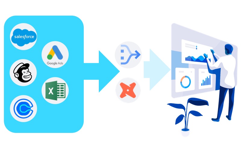
Connect to all of your Applications & Databases
PII Data Scanning
(Hash, Reject, etc.)
Customer Data
(CDP and more)
Operations Data
& Revenue Analytics
Insights & Analytics (Pre-Built & Customizable)
Data Synchronization & CDC Replication Pipelines
Automate Workflows (Set it and forget it)
Data Catalog (Control the Metadata)
Businesses choose DLH.io for all data orchestration requirements —
from simple to complex


In comes DLH.io :
Wow all your data with fast, accurate, and operational BI/Analytics insights.
The Problem we Solve is Data Chaos
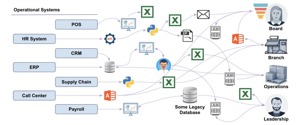
Choosing a data orchestration platform for operational insights is hard — but with DLH.io, it’s not. DLH.io is the only data orchestration and customer data enablement platform built for collaboration, visibility, and efficiency at scale; turning data chaos into data order!
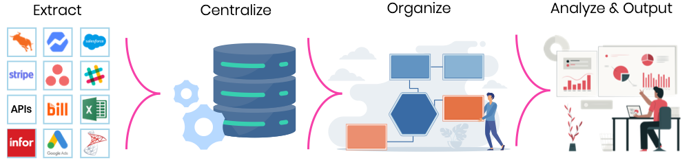
Data Orchestration
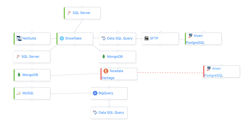
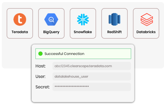
DLH.io automatically handles data workflows that synchronize and replicate your customer data, operational applications, and any database data to your Cloud Data Warehouse or other target of choice, ensuring every data point gets to the right place.
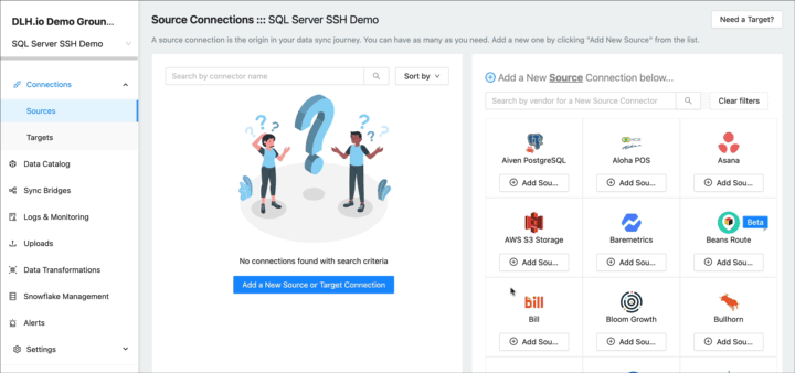
100+ Source Integrations
Choose from many pre-built source connector integrations where you are in complete control in a matter of minutes.
If we don’t have the connector integration you are looking for, tell us and we’ll build it.
Automate Data Pipelines: Sync & Replicate (CDC)
As an ongoing minute-by-minute, hourly or daily process, DLH.io synchronizes your data to a target destination of choice. It handles incremental change tracking also known as Change Data Capture (CDC) so your analytics, reporting or downstream applications are always reporting the latest data.
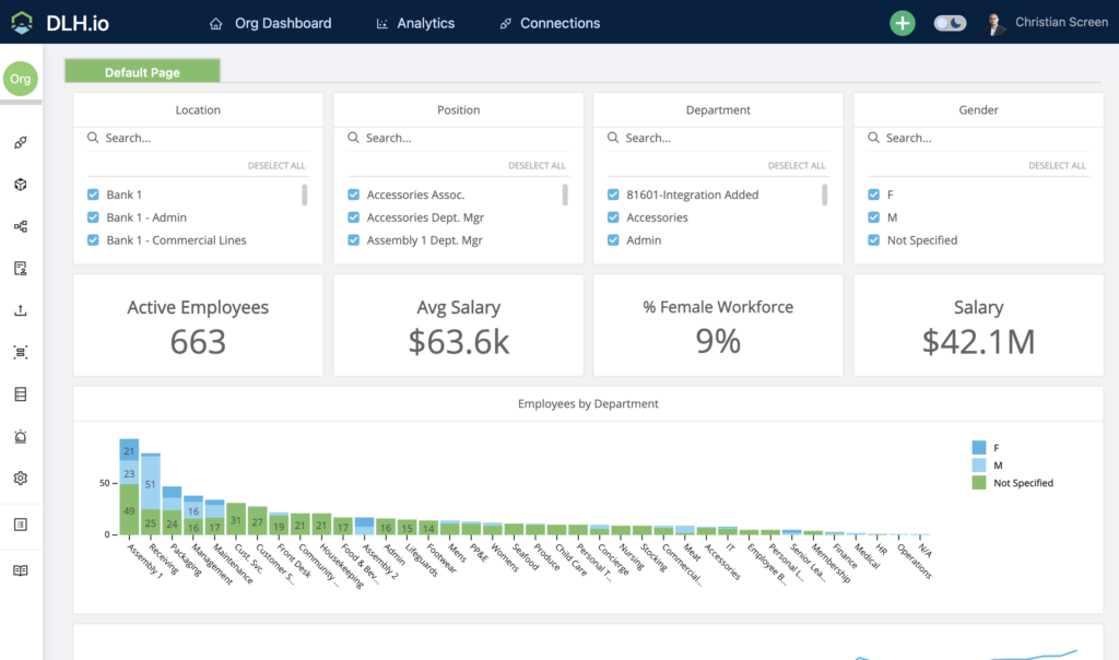
Visualize Application Insights Out of the Box
Use DLH.io pre-built analytics to actively surface visualizations, scorecards, and reports about your customers, marketing, and operations data to tell you how you are progressing towards your business goals, and provide better insight into performance and where you need help. Read More…
PII Data Scanning
Your data is important and some of it is very sensitive. DLH.io can analyze your data to determine if certain PII logic exists in the data as part of the synchronization process, detect PII data based on out-of-the-box and customizable rules, and then apply certain logic like hashing, notify users, or quarantine the data.
Collaborate on What Data Really Means
DLH.io is the only data orchestration platform that provides a built-in Data Catalog feature that allows your functional and technical teams to collaborate on data definitions. Assign people to metrics, tables, and specific columns they own; also identify Personally Identifying Information (PII) and tag it for added controls on your data.
The best from CDP, BI/Analytics and
Data Orchestration
Analytics/BI
Great for building a reference to data when you have it in a format worth viewing. This is only part of the data strategy equation.
With DLH.io, it's all here!
Built in automated workflows, BI/Analytics visualizations, pre-built application data models, and clutch data orchestration features.
Data Orchestration
In order to build data models, or to use your data in an aggregated manner you first must copy or synchronize it to a single location.
Deliver operational excellence with data-driven insights at scale.
Why DLH.io
Automate your Business Intelligence and analytics core data integrations, leverage our marketing, sales, and operation tools, workflows, and dashboards to accelerate your data to insights. DataLakeHouse.io, aka DLH.io, delivers on data orchestration/ELT/ETL and data security scanning for your digital transformation and data strategy journey, so you can focus on the high-value target aspects of your business.
Ready to get started with DLH.io?

Made with Glorious Purpose in the Carolinas
We ❤ Data Teams.
DataLakeHouse.io is a Data Orchestration and Data Security Platform built for People and Customer Insights. As an end-to-end analytics platform it offers a suite of data tools including ELT and PII Data Security, industry-specific pre-built Models with reporting, and AI/Machine Learning to offer actionable insights and predictions for extremely effective business decision-making.
PLATFORM
Compare Data Automation
Use Cases
Industry Solutions
Insights from your data and moving data in and out of your core operational systems should be effortless. Spend your team’s time on high-value target efforts that move the needle for your initiatives. Let DataLakeHouse.io handle the basics with our well-supported ELT and Analytics, Algorithms, Functions, and knowledge of data relationships so you don’t have to.